Gorodskoy Baton
I was responsible for creating visual corporate identity for a now popular wholesale bakery in Moscow. I designed the logo, packaging, storefront and on-street branding and edited photos for social media content and web store display.
Logo Design
“Gorodskoy Baton” is a classic USSR bread type, that every Russian born during that era remembers and loves.
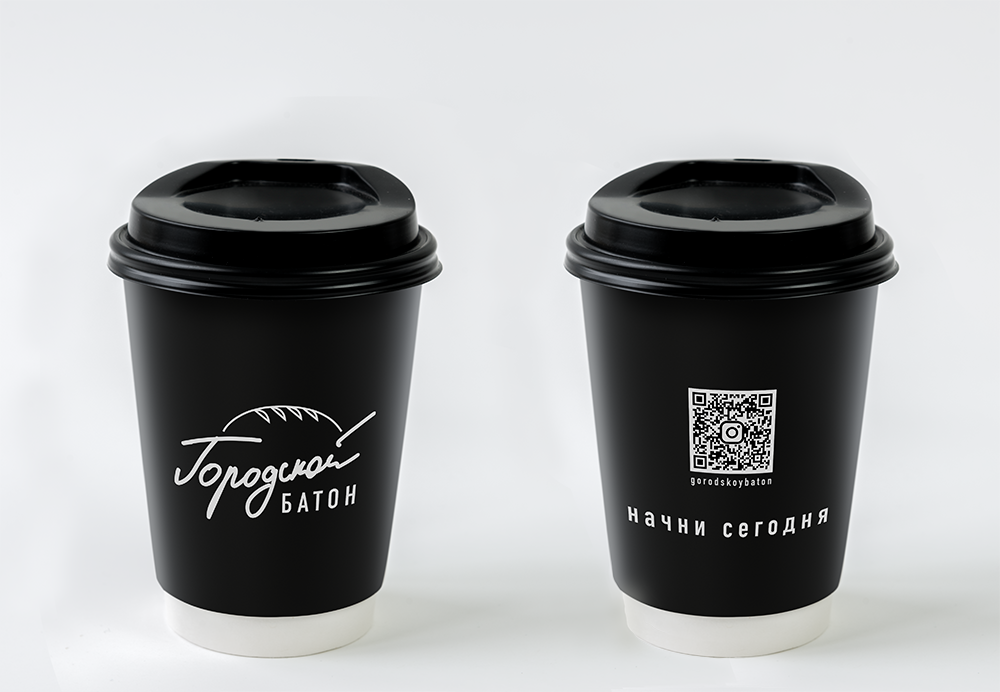
I wanted the logo to be playful, reminding of childhood and yet sophisticated to fit into the modern Moscow city image. I created two versions of the logo: one in chic black and white and the the other in soft pastel colours. This gives the flexibility of choice, depending on the use-case of the logo. To emphasise the mashup of the nostalgic and the modern I used a combination of a handwritten font, reminiscent of Soviet aesthetic and a blocky, contemporary font.
Typography
DIN Condenced Bold
ABCD abcd 1234567890
Colours
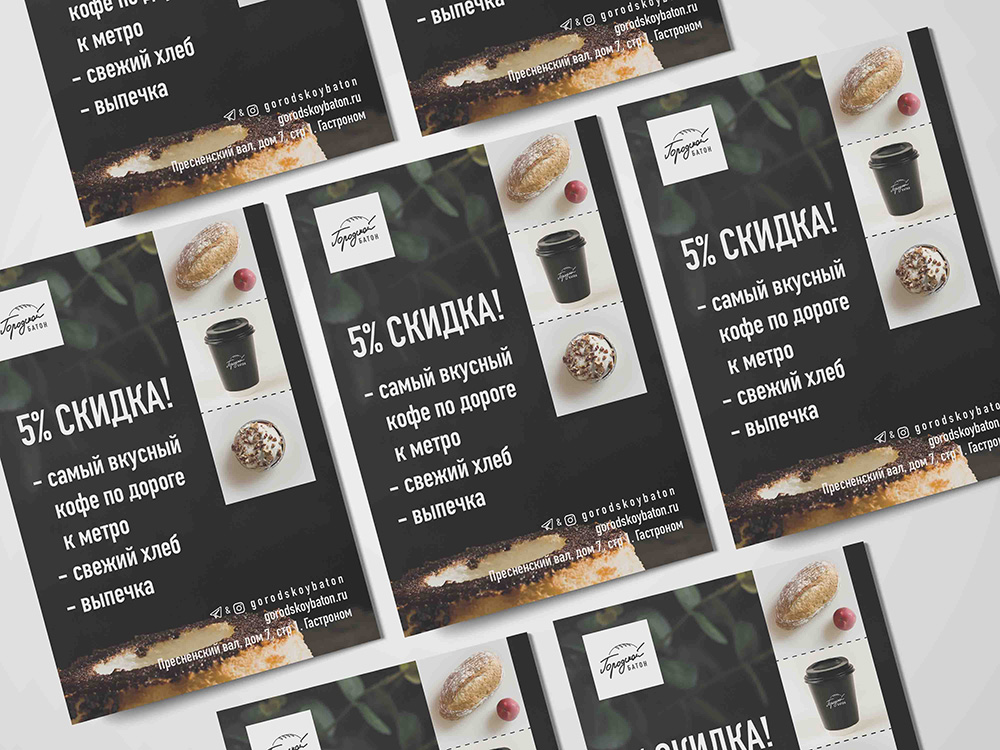
Packaging and Collaterals
For packaging and collaterals I went with a minial black and white design for a sleek modern approach.